728x90
반응형
오늘도 어김없이 본격적인 작업 이전에 괜찮은 사이트를 하나 추천하려한다. 컬러와 과련된 사이트이다. 바로 open color라는 사이트이다. 밝기별로 색깔들을 나열해 보여준다.
https://yeun.github.io/open-color/
Open Color
Color scheme for UI design
yeun.github.io
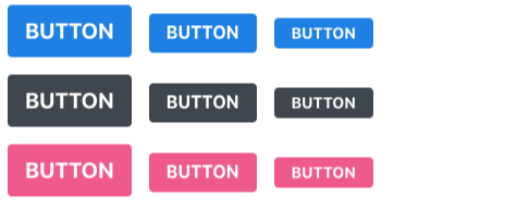
우리가 오늘 최종적으로 만들 버튼의 이미지는 아래와 같다. 자! 그럼 본격적으로 코딩을 시작해보자.
일단 예전에 작업했던 Button.js와 Button.scss에서 추가로 작성을 해주면 된다.
$blue: #228be6;// 주석;
$gray: #495057;
$pink: #f06595;


.Button{
    display: inline-flex;
    color: white;
    font-weight: bold;
    outline: none;
    border: none;
    border-radius: 4px;
    cursor: pointer;


    padding-left: 1rem;
    padding-right: 1rem;

    &.large{
     height: 2.25rem;

     font-size: 1rem;
    }

    &.medium{
        height: 1.75rem;
        font-size: 1rem;

    }

    &.small{
        height: 1rem;
        font-size: 0.875rem;
    }


    &.blue{
        background: $blue;

    &:hover{
        background: lighten($blue, 10%);
    }

    &:active{
        background: darken($blue, 10%);
    }
    }

    &.gray{
        background: $gray;

    &:hover{
        background: lighten($blue, 10%);
    }

    &:active{
        background: darken($blue, 10%);
    }
     }

    &.pink{

        background: $pink;

    &:hover{
        background: lighten($blue, 10%);
    }

    &:active{
        background: darken($blue, 10%);
    }


    }


    &+&{
        margin-left: 1rem;
    }

}
import React from 'react';
import './App.scss';
import Button from './Button.js';
function App() {
return (
<div className="App">
<div className="buttons">
<Button size="large" color="blue"> button</Button>
<Button size="medium" color="blue">button</Button>
<Button size="small" color="blue"> button</Button>
</div>
<div className="buttons">
<Button size="large" color="gray"> button</Button>
<Button size="medium" color="gray">button</Button>
<Button size="small" color="gray"> button</Button>
</div>
<div className="buttons">
<Button size="large" color="pink"> button</Button>
<Button size="medium" color="pink">button</Button>
<Button size="small" color="pink"> button</Button>
</div>
</div>
);
}
export default App;
하지만 Button.scss 파일에 있는 코드를 보면 약간 불편함이 느껴진다. 왜냐하면 색깔의 이름만 다르고 형식적으로 같은 코드가 너무나도 많이 존재하기 때문이다. 반복적인 코드의 작성을 줄일 수 있는 방법은 무엇일까? mixin이라는 것을 사용하는 것이다. mixin은 함수를 재사용하는 것과 같은 효과를 낼 수 있는 기능이 있다. 한번만 정의하면 불러와서 사용할 수 있다는 뜻이다. 구조는 다음과 같다.
@mixin button-color($color){//선언하는 방법

    background: $color;

    &:hover{
        background: lighten($color, 10%);
    }

    &:active{
        background: darken($color, 10%);
    }

}


@include button-color( $blue);//불러오는 방법
이를 활용하여 우리가 먼저 작성했던 파일의 코드를 재작성해보자. 다음과 같이 작성할 수 있을 것이다.
$blue: #228be6;// 주석;
$gray: #495057;
$pink: #f06595;

@mixin button-color($color){

    background: $color;

    &:hover{
        background: lighten($color, 10%);
    }

    &:active{
        background: darken($color, 10%);
    }

}

.Button{


    display: inline-flex;
    color: white;
    font-weight: bold;
    outline: none;
    border: none;
    border-radius: 4px;
    cursor: pointer;


    padding-left: 1rem;
    padding-right: 1rem;

    &.large{
     height: 2.25rem;

     font-size: 1rem;
    }

    &.medium{
        height: 1.75rem;
        font-size: 1rem;

    }

    &.small{
        height: 1rem;
        font-size: 0.875rem;
    }


    &.blue {

      @include button-color( $blue);

    }

    &.gray {
        @include button-color( $gray);
    }

    &.pink {
        @include button-color( $pink);
    }


    &+& {
        margin-left: 1rem;
    }


}
여기에 추가적으로 App.scss 파일을 열어서 버튼들 사이의 여백을 주도록 하자.
.App{
    width: 512px;
    margin: 0 auto;
    margin-top: 4rem;
    border: 1px solid black;
    padding: 1rem;

    .Button+.Button{
        margin-top: 1rem;
    }

}
이렇게 하면 우리가 맨처음 보았던 다양한 색깔의 버튼을 만들 수 있다.
728x90
반응형
'React > 컴포넌트 스타일링' 카테고리의 다른 글
| outline과 full width 버튼 (0) | 2020.03.27 |
|---|---|
| 다양한 Button 만들기 (0) | 2020.03.25 |
| Button 컴포넌트 꾸며보기 (0) | 2020.03.25 |
| SASS 이용을 위한 환경설정 (0) | 2020.03.24 |
| SASS (0) | 2020.03.24 |


